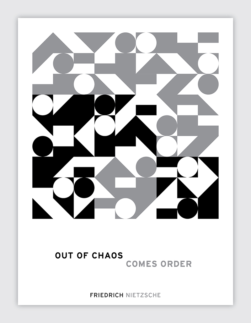
“Out of chaos, comes order” – Friedrich Nietzsche
The graphic for this poster is based on an algorithm everybody knows, Sudoku. I think Sudoku is one of the few things that really represents this quote in its entirety. The arrangement of numerals look chaotic, but at the same time there is complete order in their arrangement. When you first see the puzzle, there is even more chaos because most of the numbers are removed.
For the graphic, I created a system of icons that represented each number 1-9. Each 3x3 grid is color coded based on the sum of the given numbers in the area. The result is a graphic image that looks chaotic but has underlying order to it. And because there are so many Sudoku algorithms, the graphic can be reorganized in an almost infinite number of ways that look similar but are all different and just as orderly.
This is a poster series I designed celebrating famous architecture around the world.
I really like this set of yoga iconography I designed. They give a good representation of yoga, and the icons should feel graceful and strong, just like the practice!
This was just a fun little project I did reinterpreting the United States map into a floorplan.
This is a timeline infographic I designed showing the influences of Stanley Kubrick. It shows influences culture had on Kubrick, and in turn, the influences he had on society with each of his films.
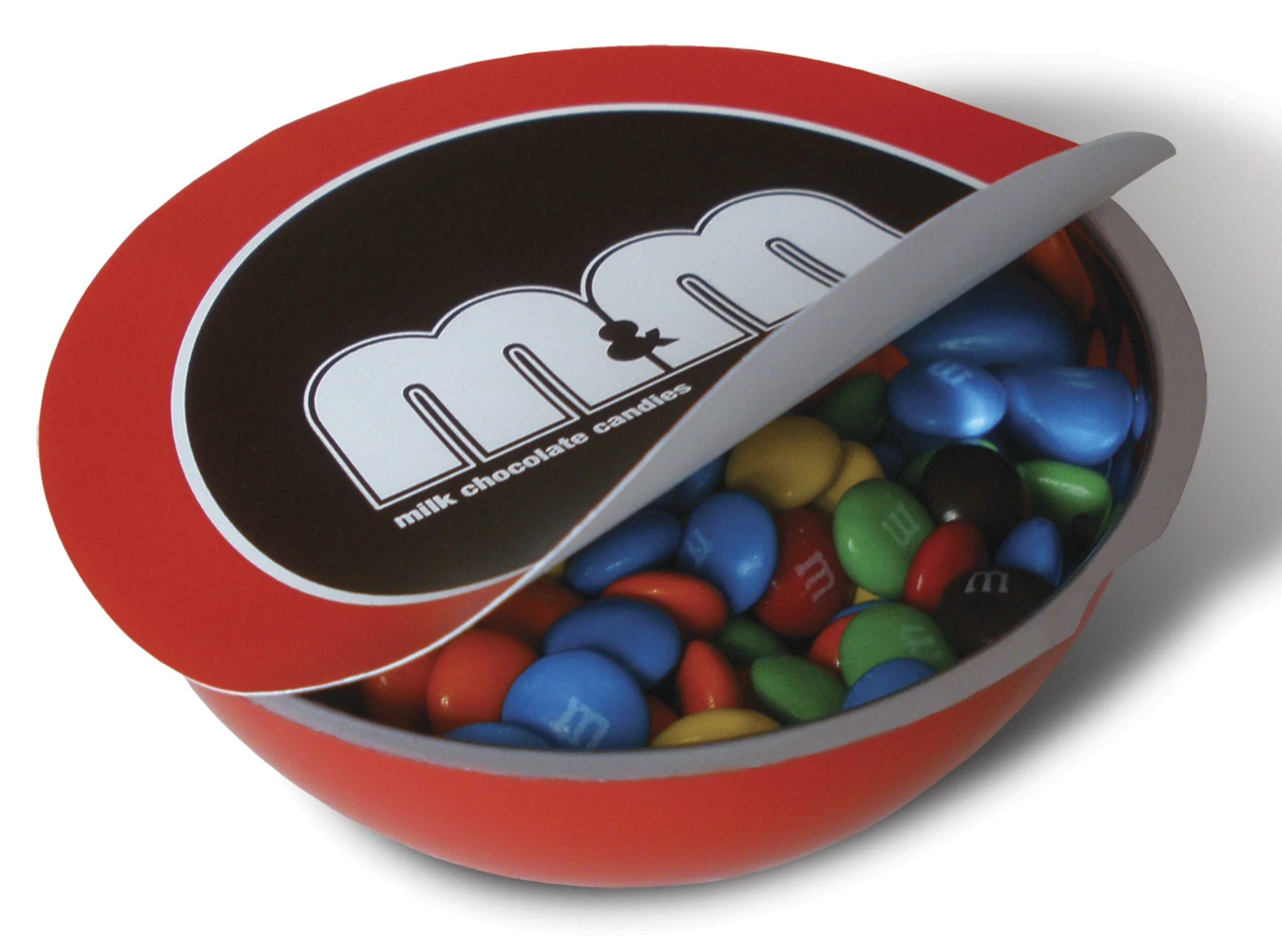
This was a fun rebranding concept for M&M's. My inspiration came straight from the candy's appearance. The logo was redesigned to be more round and smooth, and the packaging design mimics the actual physical makeup of the pieces.
This was a project I did based on the 56 distinct ethnic groups of China. My designs were based off the traditional dress of each group, and the art was inspired by Chinese cut paper designs.
Spezia Erba is a packaging concept that focuses on different exotic regions around the world. The graphics on each box would correspond with each herb/spice that is featured, and illustrated in a style representing that region. The designs are lasercut into the wood, keeping the packaging simple and natural.
In 2013, The Dieline hosted a packaging design challenge. The challenge was to showcase our design skills by incorporating our aesthetic with the dielines they provided. I was immediately inspired by book cover design, separating the three-dimensional letters into front & back covers, and a spine. Everything is hand lettered, and since there were 7 total pieces, it allowed me to really play around with different lettering styles.
"You forgive type. You read it around corners, because once you understand where you are; you see it at the beginning of a word, it's easy to follow" – Ellen Lupton
This is the first in a poster series I'm designing based on quotes I come across (well known or otherwise). I love things that are interactive, so the idea is to read the poster as it's folded, and as you flip and fold the poster around, the quote flows around the corners, through the front and back.